Internship Work - FSMOne Website Redesign
🖥️ UI/UX improvements across 5 key FSMOne pages over 12 weeks to modernise UI and strengthen navigation, trust signals, and user engagement.
📝 Context
Fully-responsible for driving UI/UX improvements across key FSMOne pages to modernise UI and strengthen navigation, trust signals, and user engagement.
👩🏻💻 My Role
UI/UX Design intern collaborating with project managers and developers to audit, redesign, and test production-ready implementations.
Focus Pages:
- About Us, Regular Savings Plan (RSP), Insurance, Account Settings
Key Problems
- Legacy UI felt dated and cluttered
- Users struggled with navigation, readability, and understanding product(s)
- Overwhelming inputs for new users
- Weak CTAs and trust signals
🎯 Goal: Improve clarity, conversions (sign-ups, insurance inquiries), and reduce support queries.

🤝 Responsibilities: Given full autonomy to liaise directly with developers and project managers. Designed within FSMOne's existing brand and design system, presented variations to senior stakeholders, and iterated until finalisation.
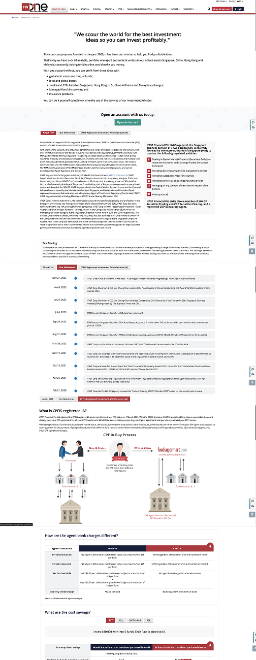
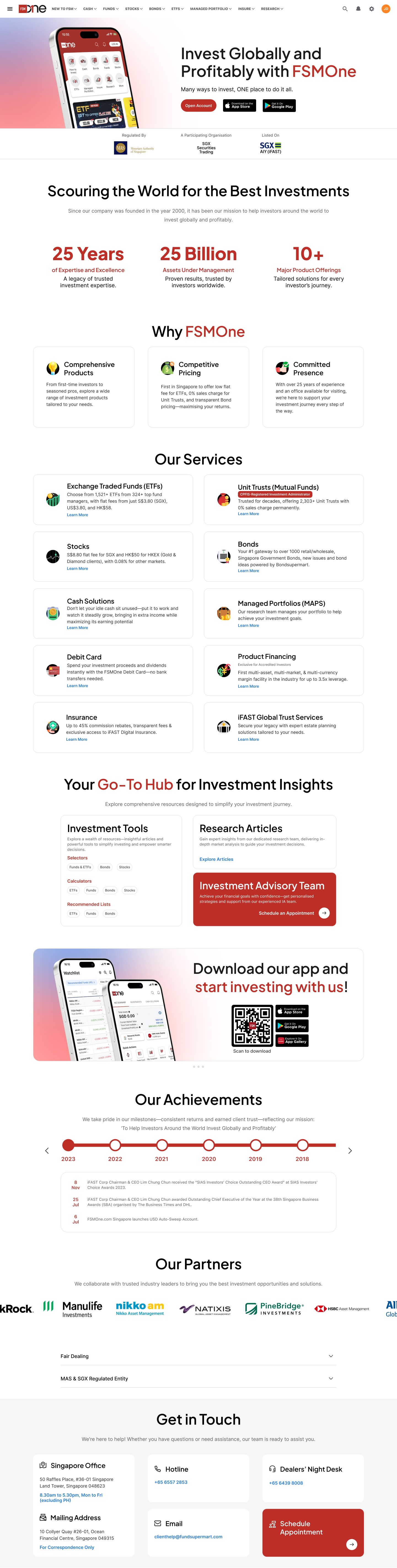
About Us Page
- Restructured dense, text-heavy content into scannable sections with clear visual hierarchy to drive conversions
- Added trust signals — regulatory badges, AUM stats, and partner logos — to build investor confidence
- Overwhelming inputs from outdated tables to card-based components and a consistent design system
Before
After
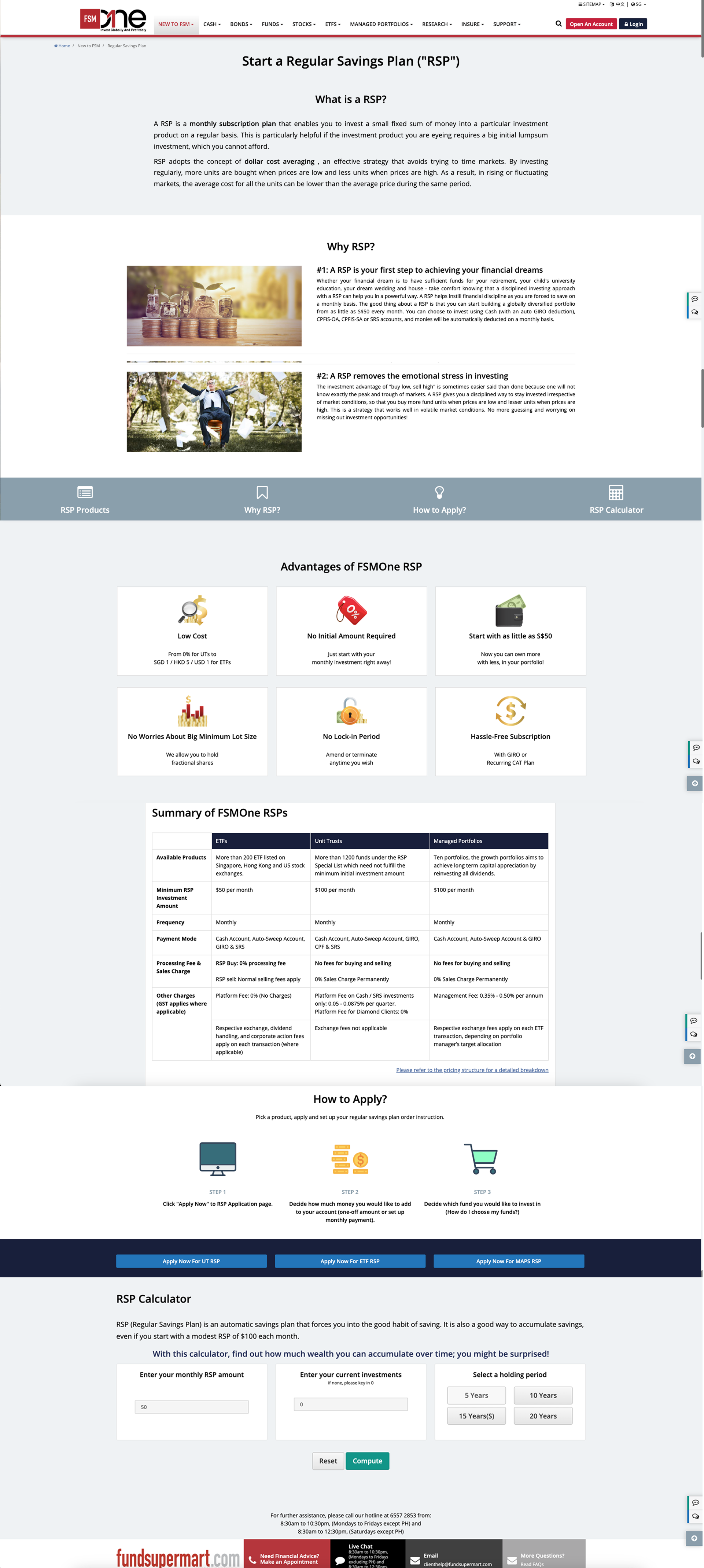
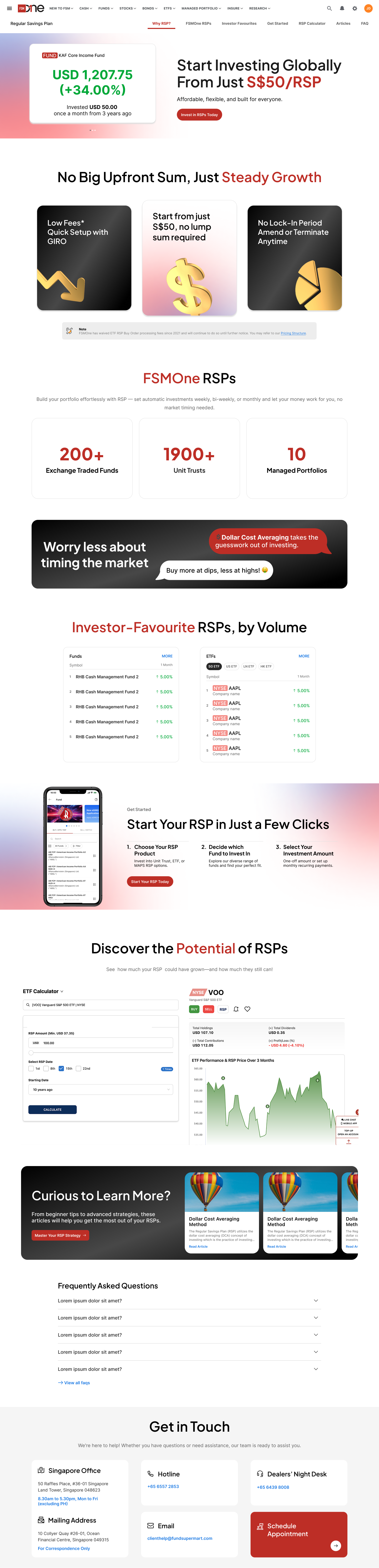
Regular Savings Plan Page
- Replaced static text-heavy explainer with a bold hero showcasing real investment returns to build trust
- Added social proof stats (200+ ETFs, 1900+ Unit Trusts) and an investor-favourite leaderboard
- Modernised the "How to Apply" section into a visual 3-step flow for clearer onboarding
Before
After
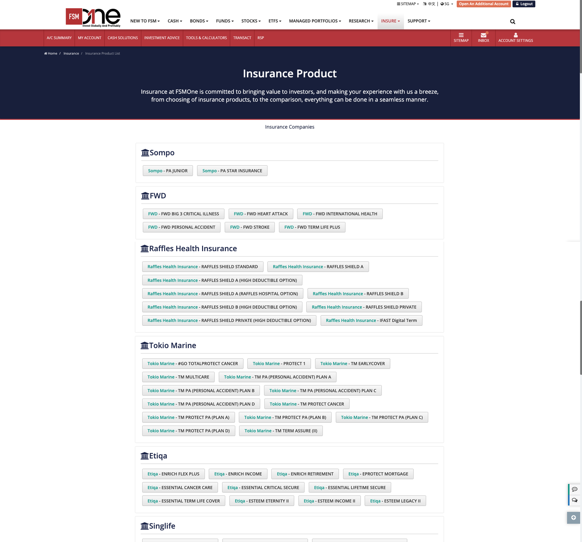
Insurance Page
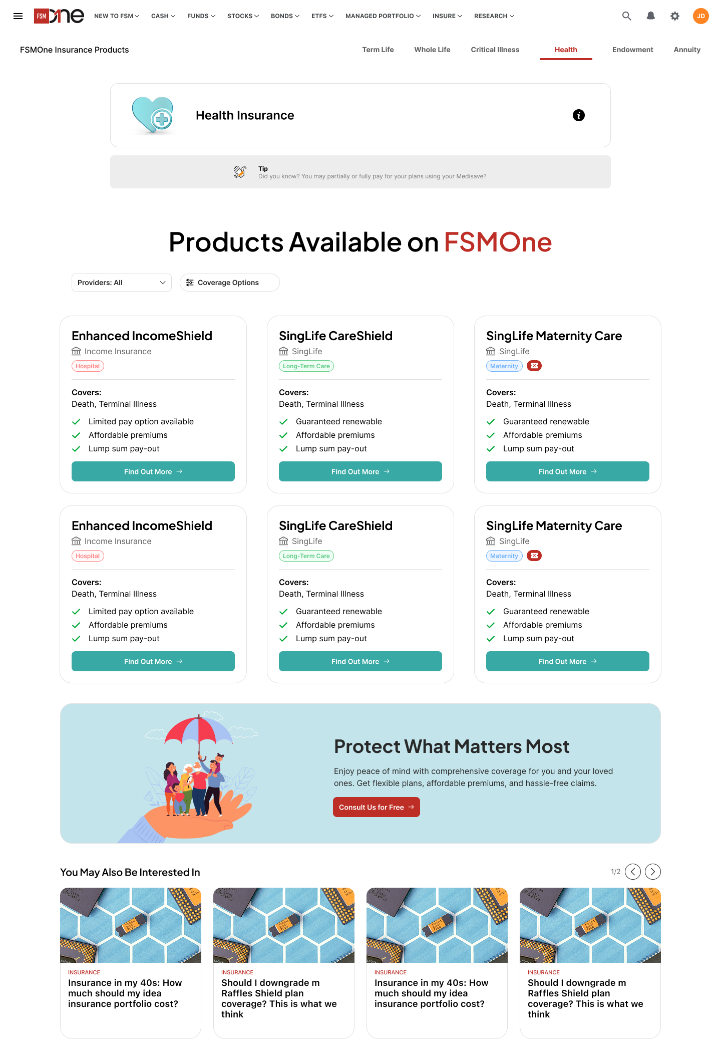
- Replaced dense, unstructured product list with filterable cards grouped by coverage type
- Introduced category navigation tabs (Term Life, Whole Life, etc.) to reduce cognitive load
- Added a conversion-focused "Protect What Matters Most" banner with a clear CTA
Before
After
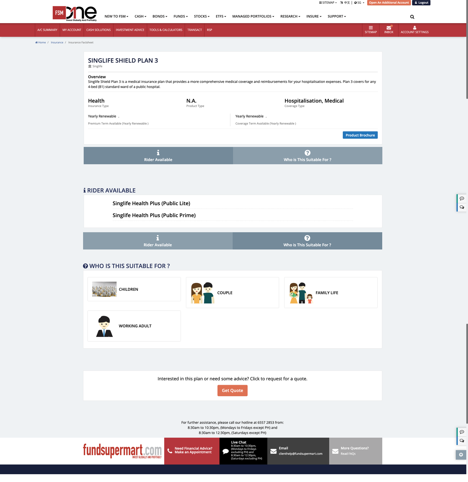
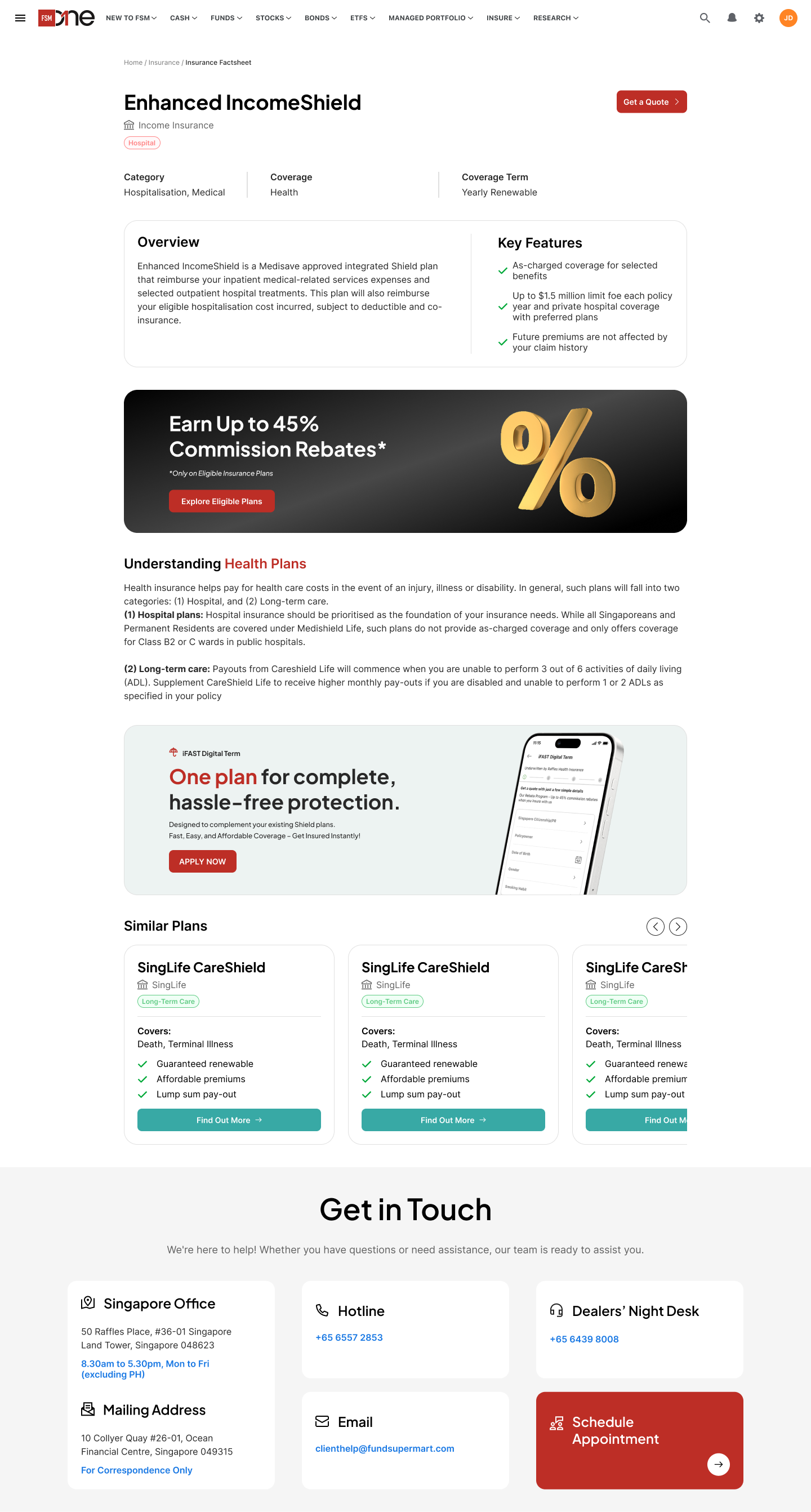
Insurance Product Page (Factsheet)
- Restructured cluttered product details into clear Overview + Key Features sections for faster scanning
- Added coverage tags and category metadata to help users quickly identify plan suitability
- Introduced a promotional banner and similar plans carousel to drive cross-sell opportunities
Before
After
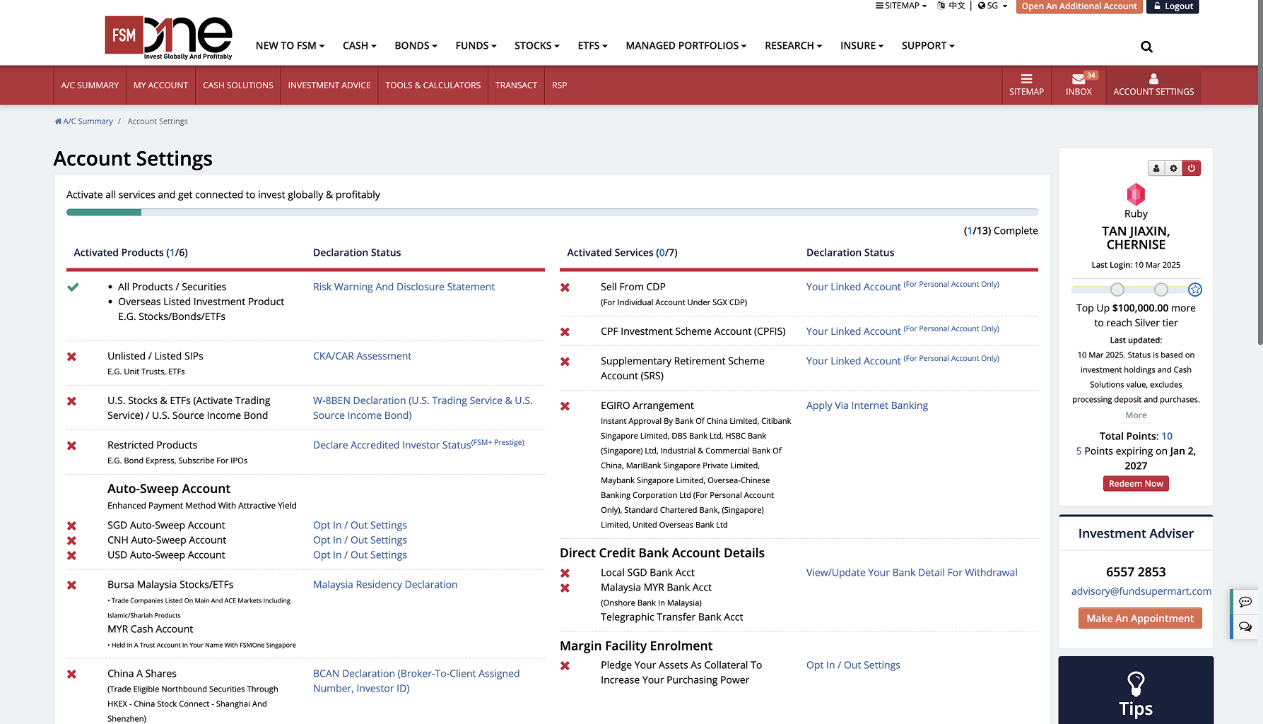
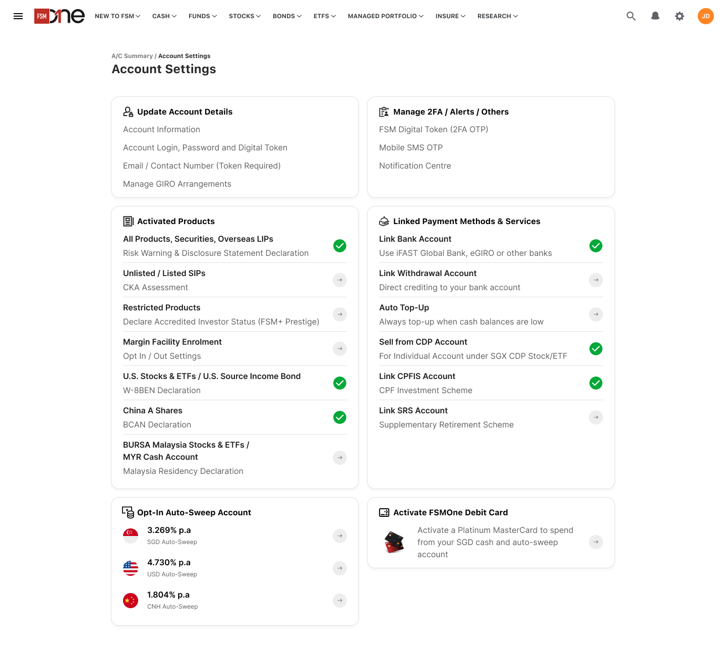
Account Settings Page
- Reorganised a complex, table-heavy layout into grouped cards with clear section labels
- Added status indicators (green ticks, arrows) to give users instant visibility on what's complete
- Surfaced key actions like Auto-Sweep rates and Debit Card activation as dedicated cards to improve discoverability